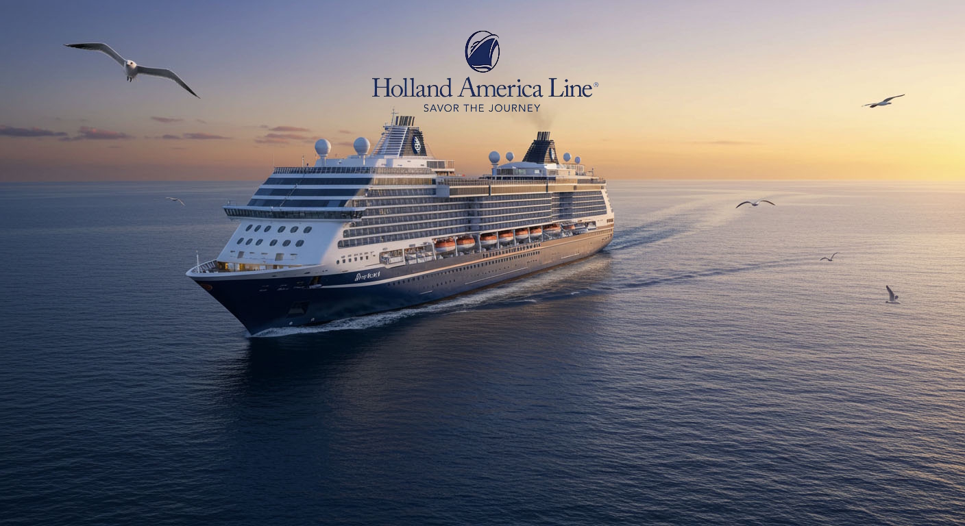
This review focuses on the official website of Holland America Line, www.hollandamerica.com. As the primary digital gateway to their cruise offerings, the website’s effectiveness in showcasing itineraries, facilitating bookings, and providing essential information is crucial. This assessment will explore the positives and negatives of the website’s design, functionality, and content, culminating in an overall star rating.
The Positives: Comprehensive Information and Elegant Presentation
The www.hollandamerica.com website generally offers a comprehensive and well-organized presentation of cruise information. Users can easily navigate through diverse itineraries using robust search and filtering tools, allowing them to sort by destination, departure port, date, and cruise length. Detailed port information and shore excursion options are readily available, often with rich descriptions and imagery that help in planning.
The site does an excellent job of showcasing the culinary experiences on board, with dedicated sections for specialty restaurants, sample menus, and clear options for booking dining packages. Information on onboard activities and enrichment programs, including live music venues like B.B. King’s Blues Club and Lincoln Center Stage, is well-detailed, allowing potential cruisers to understand the ship’s ambiance.
The website provides spacious and clear presentations of stateroom categories, often including virtual tours, floor plans, and high-quality images, giving a good sense of cabin size and amenities. The “Have It All” package is clearly explained, with its benefits and pricing easily accessible during the booking process. The site also effectively highlights unique offerings like Half Moon Cay with appealing visuals and activity details. The overall design aesthetic is clean and sophisticated, reflecting the brand’s traditional image.
The Negatives: User Experience Gaps and Support Accessibility
Despite its strengths, www.hollandamerica.com has some areas for improvement in its user experience. While generally elegant, some sections of the website can feel less intuitive or slightly dated in their interactive elements, potentially making certain information harder to find for less tech-savvy users. The sheer volume of information, while comprehensive, can sometimes lead to information overload or require extensive clicking to find specific details.
For those seeking quick answers or immediate assistance, the accessibility and responsiveness of customer support options on the website could be improved. While contact numbers are provided, features like a prominent live chat or a more dynamic, easily searchable FAQ section are not always as robust or readily available as on some competitor sites, leading to potential frustration for users with pre-booking or post-booking queries. Information regarding Wi-Fi packages and pricing is present but could be more upfront and transparent, requiring some digging to find full details and terms. Furthermore, while ship details are available, it can sometimes be challenging to quickly discern the age or most recent refurbishment status of specific vessels directly from the main ship overview pages.
Holland America Line earns a strong 4.5 out of 5 stars for its comprehensive content, elegant design, and effective presentation of cruise itineraries, onboard experiences, and cabin details. It successfully conveys the brand’s sophisticated image and provides a wealth of information for planning a cruise vacation. The website is a valuable tool for its target audience, allowing for detailed research and booking.
However, it loses a star due to certain user experience nuances that could be streamlined, particularly in terms of information accessibility for quick queries and the prominence of immediate online customer support features. While functional, a more modern and consistently intuitive interface across all sections would further enhance the digital journey for potential cruisers.


